Spellbinders BetterPress of the Month – January 2026 | Post Card Hello…
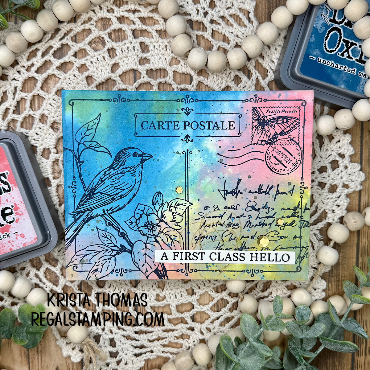
There’s something timeless about a postcard, and the Spellbinders BetterPress of the Month for January 2026, Post Card Hello, captures that charm beautifully. This month’s design feels like a little piece of happy mail—perfect for sharing a warm first-class hello.
Spellbinder Clubs have had a make-over with the new year, so be sure and check out the changes…they’ve made things even BETTER than they were! Sign up TODAY, you won’t be sorry!!
Creating a first-class background:
For my card, I wanted the background to feel soft, artistic, and a bit dreamy. I created a watercolor-effect background using Distress Oxide inks and a water spritzer. By directly applying the inks to a panel of BetterPress paper and then lightly misting with water, the colors bloomed and blended in the most organic way, giving the card that effortless, painterly look I love.
The color combination really makes this piece shine:
- Worn Lipstick & Saltwater Taffy adds a rosy warmth
- Shabby Shutters & Peeled Paint brings in a fresh, natural green
- Broken China & Uncharted Mariner grounds everything with a rich, deep blue
Together, these shades create a balanced palette that feels both cheerful and soothing.
Once the background had dried, I splattered some Distress Oxide Forest Moss and Uncharted Mariner with a wet paintbrush. This added an extra layer of texture which is subtle but pleasing.

The BetterPress Process: Quick & Oh-So-Easy!
As soon as the splatters were dry, I placed the BetterPress plate onto the magnetic Chase and inked it up with my BetterPress Black Mini Ink Pad. I carefully taped the watercolored panel to the Platen (which is the clear top plate with registration marks) and then put the Platen onto the Chase. Finally, I ran it through my die cutting machine, and the results were stunning! I seriously took a moment to ooh & aah over the finished panel!
Learn about a first-class product:
If you’re not familiar with the BetterPress System, head over to Spellbinders and check it out. It’s an amazing system and one worth owning!
Adding Some First-Class Finishes:
Additionally, and to elevate the design, I added touches of gold thread tucked behind the sentiment. The loose, delicate loops introduce texture without overwhelming the card. A few gold-matte sequins scattered across the background catch the light just enough to add subtle sparkle, enhancing the inky watercolor layers while keeping the overall look elegant.

The Post Card Hello BetterPress plate pairs wonderfully with this kind of background, allowing the design to stand out while still letting the colors and textures take center stage. It’s a fantastic set for anyone who loves combining clean impressions with expressive, mixed-media techniques.
This card was such a joy to create, and it’s a great reminder of how a simple color palette, a little water, and thoughtful embellishments can transform a design into something truly special. I can’t wait to see how others interpret this month’s BetterPress design!
Additionally, if you like the watercolor look, here’s a peek at a previous post where I watercolored some mushrooms: A Colorful Toadstool Garden…
Happy crafting 💛
Until next time,
~Krista

Please note that this post contains affiliate links. If you click on a link within this post and make a purchase, then I receive a small commission at no extra cost to you. Thank you for shopping my links 🙂
Follow me:Discover more from Regal Stamping
Subscribe to get the latest posts sent to your email.
This is really pretty!! TFS
Thank you so much!